Using the “Whatif” feature in Power BI to build a Return on Investment (ROI) Calculator

Recently I was tasked with building a Return on Investment Calculator in Power BI, for our sales team to demonstrate what sort of return a client may receive for their advertising spend.

So I needed to provide number inputs to deliver this and quickly found there are no out of the box or custom visuals to deliver this.
W.T.F?!  No, wait, I can use What-if parameters!

In this case we used the following inputs…

  • Date Period – a date range. by default we use the last 12 months, as it simplifies the process to determine and enter the other values.
  • Advertising Investment $  – what they spend with us per year. NB: We could get this from our database. we will do this in phase 2 of the tool.
  • Average Customer Spend $ – what an average customer spends per year. This should be provided by the client

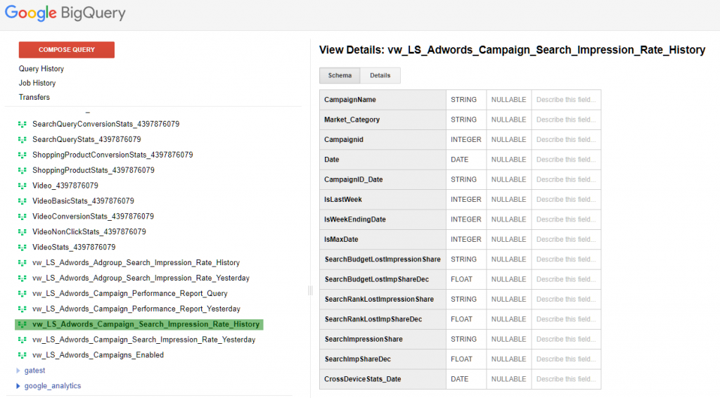
We then use traffic data (profile clicks) as a base to determine lead to customer conversion.

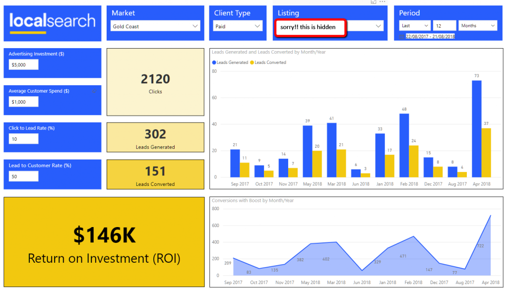
There are then inputs for conversion from leads to customers, which the customer should also provide based on their experience.

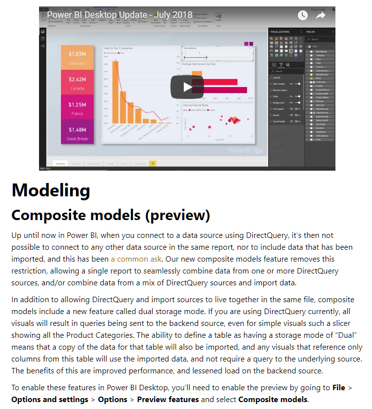
There are some restrictions on how you can use the “what-if” feature and I will run through adding a what-if parameter to highlight this. This feature was made active in the August 2018 release and is briefly described here

To create a new What If parameter, select “new Parameter – What If” from the modelling menu in Power BI.

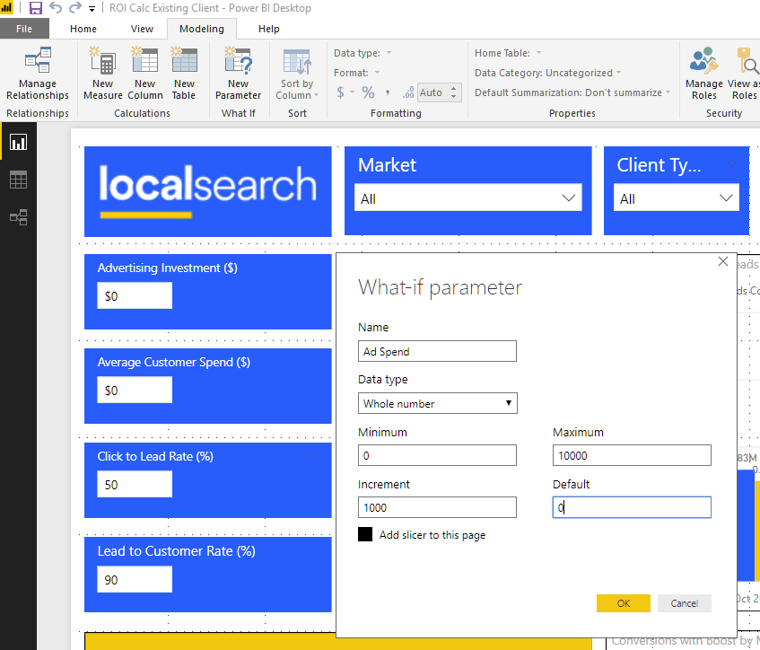
You need to give your parameter the following:

  • Name: This is what it is called in the Model. you can change the label if you use as a filter
  • Data Type: whole, decimal or fixed decimal. I used decimals for the percentages in click to client conversion rates.
  • Minimum: starting value for range
  • Maximum: ending value for range
  • Increment: value the range increment by
  • Default: what value should be used on load

This then creates a table in your model with the incremental values and the default value as a measure. this is what mine look like.

  • Advertising Investment = GENERATESERIES(0, 10000, 100)
  • Campaign Investment Value = SELECTEDVALUE(‘Advertising Investment'[Campaign Investment], 0)

As you can see from the Advertising Investment we now have a series that goes from 100 to 10000. This is where I highlight the limitation of using what if – you can only use a maximum of 1000 values.

This presents an issue for us particularly in entering average customer spend, as due to the varient of our clients it could range from $10 (cafe) to $50,000 (pool builder). This has been noted as a short coming and you can vote for Microsoft to fix it by going here

Ignoring this, the what if parameter has provided a very useful way of providing numeric input in your Power BI reports. Another big thumbs up to the Power BI team.


AdWords + Power BI Part 5 – What does this all tell us?

If you have followed my previous posts I collected data from 3 separate sources.

  • Adwords via Google Big Query
  • SERPS via our Data Warehouse & Google Big Query
  • Revenue data also from our Data Warehouse via FileMaker & SalesForce

Now What? Generally this is where you are directed by a stakeholder to provide a question, that your data helps you answer.

The following is an excerpt from the brilliant article by  – “use Power Bi to supercharge your SEO“. 

“Why would that depth of data be useful? Well, it means we can assess the difficulty to perform in the traffic-driving positions (positions 1–3) and contrast it with the expected return (revenue per click behavior from AdWords behavior for the term historically).

That allows us to laser-focus on terms which provably drive revenue for a business and quantify clearly the impact of performance improvement in revenues gained and paid spend that can be tested for reallocation once a top position is achieved and SERP CTR behavior is higher than expected for the position (indicating searchers are overwhelmingly satisfied with the organic SERP call to action).

Of course, we can flip that analysis approach into reverse and use organic data to lead PPC insights. For example, we can show the revenue available for generic search term expansion where paid behavior is better than expected — indicating a tight match between searcher intent and client product offer — and organic behavior is less than expected (suggesting some level of paid cannibalization). “

Microsoft Power BI for SEO

For us we had a few questions…

  1. How can we determine where it is worth creating Adwords Campaigns based on revenue and rank.
  2. How can we best allocate campaign spend taking into consideration competition (AdWords & SERPS rank) and expect return on investment
  3. Where are there “low hanging fruit” opportunities, where small amounts of Ad spend can make big impact.

Our approach was to score some key measures against defined thresholds and we defined this as our AdWords Opportunity Score as described  below…

The score ranges from 0-3, where 3 is the highest.

The Adwords Opportunity Score is calculated by scoring
1 point for each of the following criteria…

1. Lost of Business listed in the category:
Total listings in the category is greater then 30.

2. High value: The average revenue per cleint is
greater than $1000.

3. Strong SEO & Undersold: the average keyword
ranking is in the top 10 and there are less
then 20% paid listings in the category

OR

Weak SEO & Oversold: the average keyword ranking is
outside the top 10 (not showing on the first page of
organic search results) and the % of paid listing is
greater than 50%

Below shows the report I created with data hidden…

Adwords + Power BI Part 4 – Combine the data (AdWords, Revenue & Search Ranking) and handling Exceptions

This is a continuation from part 3 about Adwords Reporting in Power BI

So I have demonstrated how to consume Adwords data via Google Big Query in Power BI and replicate existing Adwords Datalabs reports.

Now we want to mash our data with other data and need to find something common to join on for modelling in Power BI. In our case we are combining Advertising Revenue (Filemaker) and Search Performance data (SERPS) history data from our Microsoft SQL data warehouse.

The common thread for us was Region (Market) combined with the Category. The Market is usually a group of suburbs traditionally used to produce our phone books. The Category is traditionally a grouping of service offerings in our phone books, but in the digital media and search realms, has come to mean a grouping of keywords. So combining Market & Category, we now have a way to join these data sources (for example  Gold Coast_Plumbers).

Now we have this to join on, we needed to ensure our Adwords Campaigns were named correctly, and started by producing a “Exceptions Report” in Power BI to highlight those that were not matching. This gave me an excellent opportunity to test the merge feature in Power BI and also the new functionality released in July 2018 to mix data from DirectQuery & Import Sources. I wanted to just provide a list of those campaigns in AdWords without a match in our Category Revenue data, so I used a “Left Anti (rows only in first)” as shown below.

Merging in Power BI is covered better than I could try and explain in this video with Will Thompson

Now this was all well and good until I went publish this to the Power BI service, and discovered the report would not refresh, because they are from mixed sources – Import (SQL) versus DirectQuery (AdWords). After following up with Microsoft, I discovered composite modelling is something just added in the July 2018 preview as a preview feature and is not yet usable in the service, but is under development. As a developer I am happy to work around these short-coming by running this report manually as I need it until this features is made available.

The speed of change, and constant addition of new features shows Microsoft is listening to it’s users and should be commended for this. It makes the product fun to work with and I feel like I am playing a part in the improvement of the product.

So now we have an exception report to try and make sure the data from our various sources match, and when they do match, we now are able to gain new insights to help measure, manage and inform our AdWords spending. In my next post I will share how I approached this…

AdWords + Power BI Part 5 – What does this all tell us?


Adwords + Power BI Part 3 – How do we make sure Adwords users trust our reporting in Power BI?

AdWords is a Google product, so most AdWords users have probably come across the PowerBI equivalent – Google Data Studio (beta) (well kind of doesn’t compete yet, but will discuss in another post!)…

In Google Data Studio, there are report templates, that can just be pointed to your data, for common Google products like Adwords (now Google Ads). Below is the Google Ads Overview Report Template, which is what our Campaign Strategist was using to manage our AdWords Campaigns. Inside the Google Ads API it is referred to as the “Campaign Performance Report”

So in order to make sure our Campaign Strategist trusted our data and reporting when we moved it to Power BI, I set about rebuilding this report in Power BI. To do this I needed to create a simplified view using the AdWords data-set in Google Big Query (GBQ) which I could consume in Power BI. And to do that, I needed to understand the Google AdWords (now Google Ads) tables, measures and data model, so I started here

After lots of querying inside the Google Big Query editor interface, I was able to collate most of the data presented in the Google Campaign Report Template together.

The Search Impression Share was stored in a separate set of underlying tables, so I compiled it into a view of its own to combine via a model once in Power BI.

Now I have the Adwords data I need, in the format I need, to consume it in Power BI and rebuild this report there.

I can also customize the look and filtering and show and drill to details as needed.

I can also now combine it with my other data sources for Revenue and Search Rank. But how can we combine these? This is covered in my next post… Adwords + Power BI Part 4 – Combine the data (AdWords, Revenue & Search Ranking) and handling Exceptions


AdWords + Power BI Part 2 – Getting Google AdWords data into Power BI?

This is a continuation of the series “Adwords Analytics in PowerBI

At time of writing, having the option to connect directly to Adwords data via Power BI is not being considered by the PowerBI development team, but there are options, if you are willing to write your own custom connector as suggested here. Looked a bit scary for me 😉

We do currently have the option use data from Google Big Query in Power BI thought, so what if we were able to move data from Google Adwords to Big Query?

Everyone say hi to Google Adwords Transfers

In a nutshell this requires enabling the transfer to happen on both sides (Adwords & Big Query) and giving a specific user access to do it.

You need to add a payment method to cover storage costs with varies depending on the amount of campaigns you have. We had around 500 campaigns and lost month the storage costs was close to $2 (yes $2!).

So now you have a whole set of views and tables related to AdWords in Big Query.  How do I turn this into something I can use?

This is covered in my next post… Adwords + Power BI Part 3 – How do we make sure Adwords users trust our reporting in Power BI?

Adwords + Power BI Part 1 – Analyzing AdWords data in Power BI

Anyone who works in search cannot avoid Google Adwords & Google Analytics. Power BI has built some templates for reporting for Google Analytics, but nothing exists at time of writing for Google Adwords.

We had a need to measure the success of our Adwords efforts, while also determining where it made most sense to spend on campaigns. We had some existing data we could leverage to order revenue by advertising spend and also keyword ranking.

First we had a couple of issue to solve…

  1. How do we get our campaign data from Google Adwords into Power BI?
  2. How do we combine the data (AdWords, Revenue & Search Ranking)

Then we had some other questions to answer…

  1. How do we help fix exceptions? (when data doesn’t match)
  2. How do we make sure Adwords users trust our reporting in Power BI?
  3. What are we going to show to help manage and suggest AdWords Campaign spend?

the questions will be answered in my next few posts…

Starting with How do we get our campaign data from Google AdWords into Power BI?

Mapping Adventures in Power BI (part 3)

Now when have been able to place coloured pins on a map, our users wanted us to show them a map with coloured suburb shapes, as it more accurately indicated coverage for the sales process, especially in remote areas.

Phase 3 – Show a map with coloured shape for the suburbs (free, paid)

After speaking to various map vendors about their solutions and costs (cha-ching!) we because determined to attempt to use the map provided with Power BI.

This solution required us to obtain a shape map. We went for the ASGS (Australian Statistical Geography Standard) SSC (State Suburb) map provided by the ABS (Australian Bureau of Statistics). We downloaded the zip file which contains a shape file for Australia from here.

From here it is important to reduce the size of the map and convert it to Topojson format, in order to import it into Power BI. These steps are covered well in these articles

As you can see in our map, some suburbs are not picked up correctly. This occurs when a suburb with the same name exists more than once, either in the same state, or in a different state. We are planning on over coming this by using the SSC code to unique identify states in our database and mapping using this field. I will let you know how this goes…

As always let me  know if you want more info and I hope this post was useful to someone…

Mapping Adventures in Power BI (part 2)

So continuing on from my previous post, the second phase of our tasks is to show our 2 relative suburbs (based on 2 Geo-fence radii) as colored pins on a map.

Phase 2 – Show a map with coloured pins that also indicate the suburbs (free, paid)

After testing various options to represent this the way we wanted on a map, we focused on modelling this with a bridge table and using conformed dimensions for our other related measures and filters. We also chose to use the ArcGIS Map visual which allowed us to colour the location pins the way we wanted. Below is the result.


The red pin\dot represents the chosen suburb from the slicer. The yellow pins\dots are those suburbs that non-priority clients will appear in when searching for “Plumbers” in “Kingscliff” and the blue pins/dots represent the coverage priority clients receive. This is a useful tool for our sales team to show clients what they can expect when advertising with us.

Above shows the map symbol settings and the fields and measures used to create the map. Feel free to contact me if you have any questions or want to see more about how this was built.

In the next post, I will cover Phase 3 -Colouring Suburbs as Shapes on a map

Mapping Adventures in Power BI

Having just finished work on a project to develop a mapping solution in Power BI, I though I would share some of my experiences, in case it is of benefit to others.

In a nutshell, I needed to develop a map that allowed the user (a sales representative) to select an Australian Suburb and a Category. The Categories are words used to group business types like Plumbers, Motor Mechanics, Residential Builders etc.

Based on these 2 inputs, the map would then show 2 lists of suburbs based on particular rules that applied to the category and the distance from the chosen suburb. These 2 groupings of suburbs we named as “Geo-Fences” with the rules and radii stored in our database. The reflected area that were considered “free” versus those that were “paid”. Where a business type travels to service it’s client the “paid” geo-fence is larger than “free” and where customers travel to a business the “free” is larger than the “paid”.

“You better cut the pizza into 4 pieces, because I’m not hungry enough to eat 6” – Yogi Berra

We decided to break our deliverable into 3 phases in order to split and tackle the “unknowns” as we went.

  • Phase 1 – Show the 2 lists of suburbs (free, paid)
  • Phase 2 – Show a map with coloured pins that also indicate the suburbs (free, paid)
  • Phase 3 – Show a map with coloured shape for the suburbs (free, paid)

I’ll go into each now in more detail as the speed-bumps and solutions are worth highlighting I think.

Phase 1 – Show the 2 lists of suburbs (free, paid)

Without going to too much detail about how our data is stored here is difficult, but the basic premise is that we have tables for Suburbs and Categories. The suburbs have latitude and longitude which indicated a central point like a post office to pin-point and uniquely identify them. We then had a set of rules stored in the database, which we use to determined a “Geo-Fence Radius” for a suburb and category.

SQL Spatial – A New Frontier

Well new for me at least…
Now we have a Geo-Fence Radius based on a chosen suburb (centoid or center dot) and Category (localisation rule type), we then needed to determine which suburbs were “in” and which were “out”. This is where the SQL Spatial functions made available from SQL Server 2014 on-wards, are particularly useful. With a little googling were were able to write a User Defined Table Function (UDF) that would return the list of suburbs with the derived radius based on the chosen suburb & category. Below shows a code excerpt that might be useful to see how we derived and compare distances using SQL Spatial functions like Geography…


USE [staging_filemaker] GO /****** Object: UserDefinedFunction [dbo].[ufnGetGeoFenceSuburbs] Script Date: 28/03/2018 9:39:53 AM ******/ SET ANSI_NULLS ON GO SET QUOTED_IDENTIFIER ON GO ALTER FUNCTION [dbo].[ufnGetGeoFenceSuburbs](@SuburbID int, @GeoFence_Type INT, @LocalizationRuleTypeID INT) RETURNS @retSuburbInformation TABLE  (  -- Columns returned by the function  Suburb_ID int PRIMARY KEY NOT NULL,   Suburb_Name nvarchar(50) NULL,   Suburb_Latitude nvarchar(50) NULL,   Suburb_Longitude nvarchar(50) NULL,  Suburb_GEOG geography,  GeoFence_Type INT NULL ) AS  BEGIN  DECLARE   @Origintext varchar(100),  @Origin GEOGRAPHY,  @GeoFence_Distance as INTEGER;  ---- center point  SET @GeoFence_Distance =   CASE WHEN @GeoFence_Type = 1 THEN  (SELECT (CAST(client_listing_geo_fence_radius as INT)* 1000) --Multiple by 1000 for Kilometers  from Suburb_Localisation_Rule_Type as SLRT where SLRT.suburb_id = @SuburbID and SLRT.localisation_rule_type_id = @LocalizationRuleTypeID)  ELSE (SELECT (CAST(free_listing_geo_fence_radius as INT)* 1000)   from Suburb_Localisation_Rule_Type as SLRT where SLRT.suburb_id = @SuburbID and SLRT.localisation_rule_type_id = @LocalizationRuleTypeID)   END  SET @Origintext = (Select 'POINT(' + Longitude + ' ' + Latitude + ')'   from Suburb as SBRB where SBRB.[Suburb ID] = @SuburbID) -- Set Suburb  SET @Origin = GEOGRAPHY::STGeomFromText(@Origintext, 4326); --The code 4326 represents Kilometers  --SELECT @Origin, @Client_GEOG_Distance  ;WITH CTE_Suburb_Geography as (Select [Suburb ID], [Suburb Name], GEOGRAPHY::STGeomFromText('POINT(' + Longitude + ' ' + Latitude + ')', 4326) as GEOG, Latitude, Longitude --  from Subrub as SBRB) --WHERE [Suburb ID] = @SuburbID)  --SET @SuburbID = SELECT [Suburb ID] FROM CTE_Suburb_Geography  --IF @SuburbID IS NOT NULL   --BEGIN  INSERT @retSuburbInformation  SELECT [Suburb ID] as Suburb_ID, [Suburb Name] as Suburb_Name, Latitude as Suburb_Latitude, Longitude as Suburb_Longitude, GEOG as Subrub_GEOG,   CASE WHEN @GeoFence_Type = 1 THEN 1 ELSE 0 END as GeoFence_Type   FROM CTE_Suburb_Geography WHERE @Origin.STDistance(GEOG) <= @GeoFence_Distance; -- This determines whcih suburbs are within the defined distance  -- END;  RETURN; END; GO

This has been some discussion in Power Bi forums as to why these functions are not yet included in Power BI. You can add your vote here – Support SQL Server Geometry/Geography data types in Power BI

The end result is that we are able to the model the Geo-Fencing for suburbs and present it in Power BI as 2 dynamic list as shown below.


Phase 2 – Show a map with coloured pins that also indicate the suburbs (free, paid) will be covered in the next post