
So continuing on from my previous post, the second phase of our tasks is to show our 2 relative suburbs (based on 2 Geo-fence radii) as colored pins on a map.
Phase 2 – Show a map with coloured pins that also indicate the suburbs (free, paid)
After testing various options to represent this the way we wanted on a map, we focused on modelling this with a bridge table and using conformed dimensions for our other related measures and filters. We also chose to use the ArcGIS Map visual which allowed us to colour the location pins the way we wanted. Below is the result.
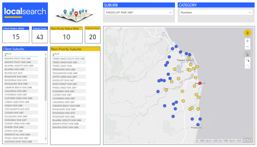
The red pin\dot represents the chosen suburb from the slicer. The yellow pins\dots are those suburbs that non-priority clients will appear in when searching for “Plumbers” in “Kingscliff” and the blue pins/dots represent the coverage priority clients receive. This is a useful tool for our sales team to show clients what they can expect when advertising with us.
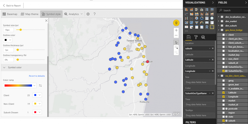
Above shows the map symbol settings and the fields and measures used to create the map. Feel free to contact me if you have any questions or want to see more about how this was built.
In the next post, I will cover Phase 3 -Colouring Suburbs as Shapes on a map
One Reply to “Mapping Adventures in Power BI (part 2)”
Comments are closed.