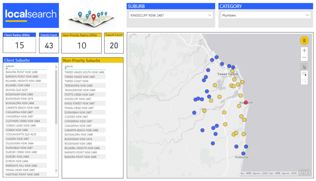
Now when have been able to place coloured pins on a map, our users wanted us to show them a map with coloured suburb shapes, as it more accurately indicated coverage for the sales process, especially in remote areas.
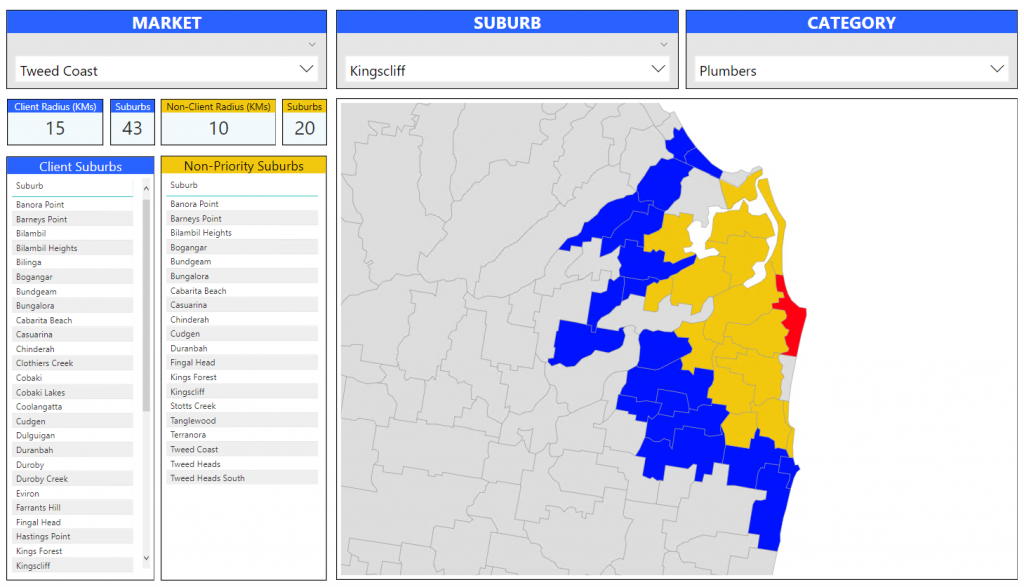
Phase 3 – Show a map with coloured shape for the suburbs (free, paid)
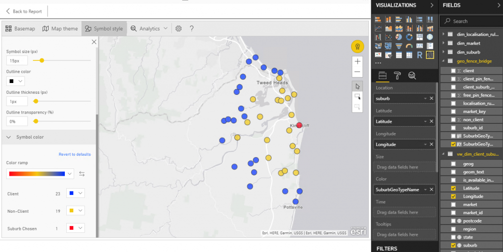
After speaking to various map vendors about their solutions and costs (cha-ching!) we because determined to attempt to use the map provided with Power BI.
This solution required us to obtain a shape map. We went for the ASGS (Australian Statistical Geography Standard) SSC (State Suburb) map provided by the ABS (Australian Bureau of Statistics). We downloaded the zip file which contains a shape file for Australia from here.
From here it is important to reduce the size of the map and convert it to Topojson format, in order to import it into Power BI. These steps are covered well in these articles
- Enhancing your geography visuals with PowerBI Shape Map
- Overcoming Potential Power BI Shape Map Rendering Issues
As you can see in our map, some suburbs are not picked up correctly. This occurs when a suburb with the same name exists more than once, either in the same state, or in a different state. We are planning on over coming this by using the SSC code to unique identify states in our database and mapping using this field. I will let you know how this goes…
As always let me know if you want more info and I hope this post was useful to someone…